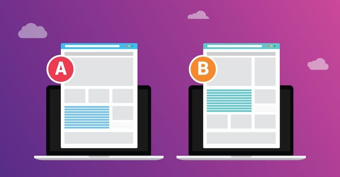
If you’re not A/B testing when it comes to your marketing content, you are leaving valuable dollars on the table. A/B testing is the best way to increase conversions, test assumptions, gain audience behavior insight, and make data-driven decisions that move the needle for your business.
Simply put, an A/B test or a split test is an experiment between two or more variations of a web page, email newsletter, online ad, or any asset to see which performs best. It may be as minute as changing the color of your call-to-action button on your landing page, or something more obvious such as testing the use of lifestyle imagery versus illustrations in your Facebook and Instagram ads.
Here’s An Example
Let’s say for instance that you have a strong hunch that one particular headline will be more captivating on your landing page than another used in past campaigns. You could roll the dice and place your bets, but what happens if you come up short? Marketing dollars are precious and mistakes can be costly. By conducting an A/B test and sending half of your audience to one page with the new slogan, and the other half to a page with the old, you are able to determine the favorite before going all in.
Not sold on the value A/B testing provides? Let’s take a look at some convincing case studies that will change your mind.
Open Rates Increase 500% with Email Subject Line Testing
Most email marketing platforms offer A/B testing functionality, making this an experiment you could potentially try out yourself! By experimenting with different subject lines you are able to measure the effectiveness of each on open, click-through, and conversion rate. In the example below, you can see that subject line A had a substantially higher open rate and thus led to a 500% increase in opens for this particular campaign.


Form Submission Lift Using Google Optimize
Wanting to increase the volume of form submissions on our landing page, we turned to Google Optimize (a digital marketer’s BFF and sophisticated website optimization tool).
Our contact form was buried at the bottom of the landing page and limited visibility meant limited conversions. Using Google Optimize we were able to duplicate the landing page and change just one variable, the placement of the contact form. Knowing what we know about scroll behavior, time on site, and user attention spans, we moved the contact form above the fold, front and center.
We split the traffic 50/50 and ran our experiment to test which placement resulted in a greater number of form submissions. At the end of the experiment, the new placement was the clear winner with a 99% probability to beat the original.
For us, it wasn’t a huge surprise that the new placement would create a lift in conversions. It’s more about living in the mindset of continual testing. No matter what you believe may be true, test, test and test again.


Website Conversions Increase 7X with Facebook Ad Testing
Are you blindly putting images and headlines together in your paid social ads, hoping they will result in an abundance of site traffic and conversions? Believe it or not, there’s an actual method to the madness that makes your dollar go the extra mile.
A/B testing your paid social ads is the best way to identify high performing combinations of objectives, ad styles, audience targeting options, images, headlines, emojis, call-to-actions, and much more!
In the A/B test example below, the goal was to identify the best performing image. Keeping the primary text, headline, and ad style consistent, the only variable was the difference in imagery. During a two week testing time period, the winner (green) resulted in 7X the number of conversions with a cost-per-conversions almost half the cost of the loser (red).


Since Facebook best practices suggest running three ads within each ad set, it is recommended to turn off the least favorable ad and create a new ad to run against the best performer. The opportunities for testing are endless, so feel free to get creative!
If it seems a little nerdy, it’s because it is. 🤓At Wilmington Design Company, A/B testing is our bread and butter. If you or your marketing agency isn’t already testing everything and anything, we invite you to get in touch with us to see how you can increase ROI, conversion rates, and move the needle for your growing business.


